Graphics & Standards
The beauty of a technical or presentation drawing is that the graphic notation used can be whatever you want. Standards always change for each office, and many times are adjusted to be project specific.
Standards in Flux
The following pages/articles are what we utilize as our standards. We are consistently challenging these and adjusting as our projects grow and change over time.
We also find ourselves frequently adjusting and straying away from the graphic standard for specific drawing types. We have to acknowledge that a presentation plan needs different care and attention than a technical floor plan. It would be silly to limit yourself based on one convention, when the drawing types are communicating completely different things.
These pages/posts will focus on technical drawings, for the US market.

Our Standards, Maybe Not Yours
Always reference your own internal office graphic and standard guides, as well as previous project sets to better understand how these standards may– or may not— fit within your own work.
How to Use
As these may not fit within your own standards, we highly recommend letting these standards battle against your own internal documents. Let the winners come forward and influence the others. If you notice you’ve skinned the cat’ a better way, please reach out and share so we may consider it as an alternative to ours. At the very least, these standards will show you our attempt at conveying graphic guides that an office can strive for. Use it as a checklist, use it as a sounding board,… use it however you see fit.
Industry Consistent
Generally, you should always strive to be as industry consistent as possible with all graphics and terminology across your technical sets. This helps others within the industry read and interpret your drawings faster, and makes them generally more legible. Beyond helping other external parties like Contractors and Owners, it will also allow you to have employees get up to speed with your standards faster and keep them consistent easier. Many employee onboarding questions can be squashed before they even start by having them read the graphic guideline book before drawing.
Remember that, the more unique your standards are, the longer it would take for employees to get up to speed. And as always, the drawings need to be consistent across the set. If a graphic is incorrect somewhere, it should be consistently ‘incorrect’ everywhere.
Consistency is Key
Consistency is critical to legibility. What this means is that if a wall tag looks different from your normal graphic standard, it should still look consistently like the same wall tag across that entire drawing set. In general, it is always easier to correct 1 problem consistently made across a set, then 2+ different problems.
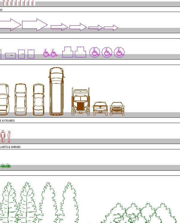
Our Knowledge
Why care about what we think? We’ve worked in multiple cities and offices while executing projects in different countries across numerous years and disciplines… we’ve come to learn a thing or two about standards. We have consistently sought out the best standards from various sources and used them to influence our own internal graphic guides. Check back often as this page will eventually come to host all of our internal graphic guidelines.



Leave a Reply
You must be logged in to post a comment.